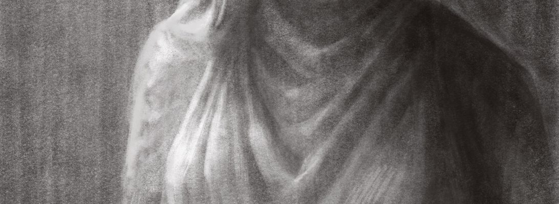
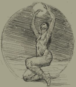
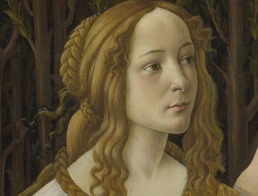
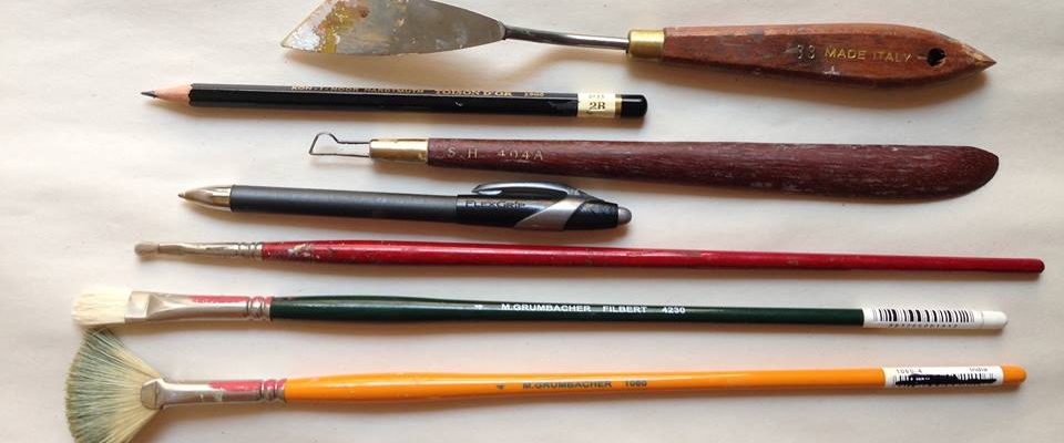
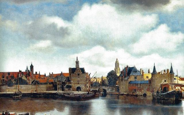
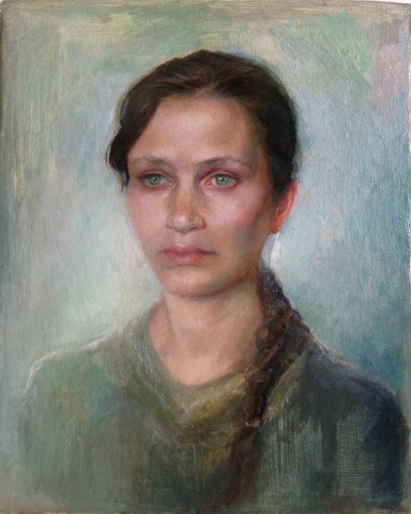
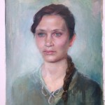
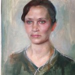
I could largely divide my approach to drawing into 3 main stages: The pre-Atelier, Atelier, Glenn Vilppu stage, and lastly the (omg I can’t believe I’m saying this) Russian Academy stage.
This might be a technical article for most people who might read this, but very interesting for me. If you are not an artist, you might still find it interesting because I will go through different approaches to drawing and try to explain them in simple, non-technical language. If you ARE an artist, you might still find it uninteresting because you have your own approach and who cares about the rest? So We’ve established that everyone will find this boring except for me, and now I’m ready to proceed writing it.
Most interesting to note is that, throughout my life, my motivation as an artist has hardly changed. The things I want to express are mostly the same, even though the way I express them is different. The method hasn’t affected the content very much, but rather gave me different tools to express it.
My pre-Atelier stage, or the childhood stage, is, I think pretty common. I drew the appearance of shapes and outlines, the way most people who haven’t learned drawing do. It had very little sense of 3D and the idea of shading or rendering was foreign to me. I drew in order to tell a story and shapes were more or less enough for that.
The stage before the atelier was a couple of years when I attempted to teach myself observational drawing by copying photos. I thought I was awesome because I could copy well. Tooks a few years to remove this false pride off of myself and realize how foolish it is. But yes, I did the photo-copy thing for a while, until I realize I was somehow stuck. Not knowing why or how but just having it as a feeling.
The next stage is the Atelier stage. I spent 3 years studying in the full time program at Georgetown Atelier in Seattle. It was rigorous and meticulous training that taught me a few key ideas.
For one, it was the first time I spent a lot of time drawing from observation and gained tools to learn to observe. It’s a funny thing, that observing is something that has to be learned. But you literally, cannot successfully copy the complexity of what your eyes see without a method in mind.
But more basically, in terms of drawing the figure, I learned to establish logical connections within the drawing, I learned the idea of proportions
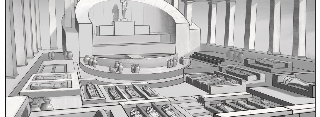
I gained so much knowledge in this world building class at Brainstorm in the summer of 2019. Since then it’s been hard being able to afford any more art classes, and then the world went to hell in 2020. I’ve been focusing on starting a business, which I will elaborate on some other time. But enough about that. I wanna talk a bit about these:
I chose ancient Egypt as the theme for all the drawings I did in the class. The temple was modeled in 3D and then illustrated in Procreate. The rest were drawn in Procreate (an iPad pro software). The image of the market involved a lot of application of everything I’ve learned regarding value grouping and management, and I consider this to be the first time I really applied value organization across an entire scene. The buildings were fun to make, and the interior too. It was great expanding on what I usually create.
Those were really intense 9 weeks and a lot of fun.
A few months ago I got a tablet, an iPad Pro with an apple pencil, and truth be told, ever since I got it, I’ve been doing so much digital artwork that I almost completely neglected my traditional media.
From the moment I held that Apple pencil it was like a new romance…. The freedom, the excitement! The endless possibilities of things to creat on the tablet! The world is only limited to the size of the screen 🙂
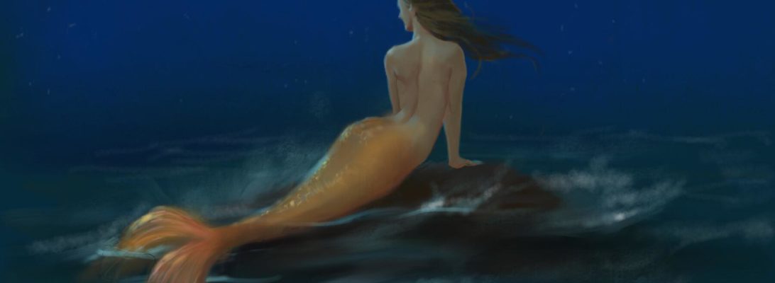
The first painting I made on it on the day I got it was this mermaid at night:
It was the best experience… to be there, breathing in the fresh air of the sea, looking at the stars and thinking of the freedom that that world offers. I was discovering new brushes and also breaking my head figuring out the structure and colors.
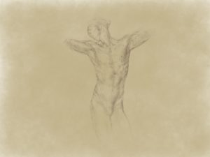
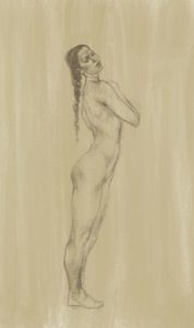
Since then I’ve used the iPad to create a lot more stuff. I started taking it to figure drawing sessions to draw from a model:
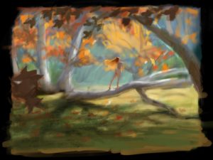
Doing inventive figure drawing and color studies:
Fairy in the forest digital painting
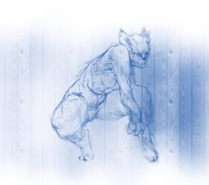
Cat Human Hybrid
I think that drawing digitally has made me bolder as an artist, because it put me in the habit of making big decisions (since it is easier to change things).
I hope to slowly update new digital artworks on the website as time goes by.
and I think today I have made a breakthrough in finding the answer to a question that has been bugging me for a very long time.
I’ve been trying to study the “right” and the “wrong” way of making art, to find some guiding principles, something to go by in order to make “good art”.
And at the same time asking myself – those artists that lived in the past and even in ancient civilizations, did they really know some magnificent secrete that we, in modern times, have lost? Why does their art seem serious and whole, while ours, which is more informed, more realistic, lacks that sense of telling a simple, fundamental truth about the world?
For example, one step in my chain of discoveries was that good art involves storytelling. And like any verbal storytelling it has to be selective. It has to be tied to the theme.
But can that be used, like some kind of formula, to create “good art”?
That’s what I question. Surely, yes, it can, to some degree. It can help you debug your novel when it seems to go awry with too many details, for example.
But fundamentally good art comes from the artist’s genuine desire to describe something, and their focus on that thing that they want to describe.
Not their focus on how to impress, not their focus on how to please a critic, but just a focus on the thing they’re expressing.
Ancient Egyptian art lacks realism, but the confidence it has in its style and its devotion to telling its essential story are what make it beautiful. There is sincerity of a mind describing a thought there.
What have we done in modern times? We have replaced that desire with an impersonal aspiration of some kind. We ran away from realism in an attempt to find “individuality”, and then we came back to realism in an attempt to find “excellence”, and neither attempt is really fully successful, isn’t it..
Of course you could make the point that someone with no art training at all would just create a mess, and that is a very good point indeed.
But also, someone with lots of art education and excellent execution can create something stale and formulaic.
To speak beautifully – you need words, and then you need to have an idea that is Your owN.
Art that has no hesitations about the fundamental way it should be done, is possible when the artist has taken the time to learn the tools they need for that execution. And which tool they acquired was dictated by what they wanted to express. And that the tools themselves are a result of a sincere quest for expression.
A self trusting soul is earned and created by the habit of not hiding from its own questions, but trying to answer them, instead.
A thought about tools and painting: The tools we hold actually change our thinking. A tool determines what can and can’t be done, what solutions and options are open to us or not.
Our subconscious looks for solutions based on the options our tool provides. If the size or shape of your brush is not the one that matches what you envision should happen on your canvas, then you will probably get something that doesn’t exactly match your vision. Same thing for the paints you use or how the surface of the painting is like.
Like trying to do a block-in with paint on a very absorbent surface. The brush doesn’t want to move and it’s hard to draw. It can change the way you do your block-in. The drawing may come out more segmented, for example.
Or how about trying to create bright chroma with a muddy pile of paint?Trying to create large shapes with a small brush. Trying to create straight edges using a rounded brush. So my conclusion is that it’s nice to incorporate the habit of spending a minute to choose the right tool before I start working.
One of the strangest things I came across which has stayed with me, was one person’s description of how they feel about Enya’s music. They said they like her music a lot, but that they feel that it lacks emotion. To me that was the strangest thing to read, because I feel the complete opposite about her music. Her music is calm and pleasant, but the heart of that quietness, the slow-ripples-in-a-pond-like style lies a very deep emotion. I think it can be easily noticed when one compares her calm music with calm “elevator type” music. But it led me to think of a more general truth: The nature of the communication of art and its objectivity.
Art can obviously be experienced differently by different people.
The same works in paintings. An artist could paint an abandoned alley in golden daylight, think they captured that feeling of solitary glow perfectly, that feeling of slow sunlight shining quietly on the world in hidden corners, but someone else looks at the same painting and sees only the alley. They might sum up the painting by saying: “Oh, isn’t this the corner of 5th and Main? I think I know this alley!”.
However, and here is the important part: A different person with the right “emotional vocabulary” will see the meaning of the piece in the same way the artist thought of it instantly. It will be as obvious to them as to the one who created it. And the clues will all be there in the piece, too; the emphasis; not on the structure or the concrete details of the street, but rather on the interaction of light with the objects in the scene.
But an artist simply cannot create anything that will automatically impose its meaning on an observer. Such a thing is unobtainable.
Art speaks a language whose meaning can only be understood by having the complete emotional vocabulary. The meaning is there, but it has to be decoded by having the right “dictionary”. To a large degree I think all people have a lot in common in terms of their “dictionaries”, but they also have huge differences depending on their personality, life experiences and associations.
I also believe these different “dictionaries” can be explained and shown, to some degree, and that eventually, through differentiation from other artworks, someone can be made to see the essence of an artwork in a more precise, nuanced way. And I realize that this also applies to me regarding artworks I don’t immediately relate to or understand.
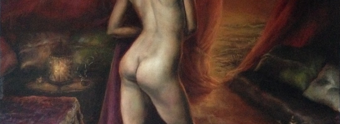
It started with a square canvas which I built from wood. One of the first panels I ever made. It was the summer vacation in my Art school in Seattle and some of the students hired a model to pose for us for a long pose. 6 hours a day for 4 days.
I brought the canvas with me not knowing what the pose will be. When I finished the painting, working from life, it had an abstract background. I placed the figure in the center and I had no idea of what environment she might belong to.
I was really inspired by the pose but I felt that an abstract background did not fit it at all. A few months later, I realized what the right background for this figure is: It needed to be the inside of a tent, overlooking the desert at sunset, because the woman reminded me of some kind of Arabian royalty. The pose was very organic, and communicated confidence and relaxation at the same time. I imagined her being on a journey of some kind, and being royalty, the tent would naturally be luxurious and private.
So I decided to take the pose from the 4 walls of an art studio into a setting closer to a fancy bedouin tent. Having been in those a few times in Israel in the Negev desert, and getting a glimpse of that very simple, slow lifestyle, I wanted to paint something with that warm, slow atmosphere, something that adjusts itself to the pace of the desert where life moves slowly at the end of the day.
That new aspiration presented a challenge, because I had to invent the background and have it match the studio light – the light under which the model was standing. At that point I started searching for references for different bedouin tent elements online. I tried to get an idea of how a fancy Bedouin tent might look like and what kind of items would be in it. I used photoshop to try to arrange them together to get an idea of an environment. After a while of doing that I realized the complexity of the scene requires a much more realistic model to paint from, if I wanted the background to match the degree of detail of the figure.
I went to a craft store, where I shopped around for a few hours, gathering items and getting ideas. When I left the store I had almost everything I needed and I sat down to build the tent.
I made a tiny little sculpture of the women to “calibrate” the light. Used a clamp-on book light to replace the studio light and used a candle for a lantern. Overall there were 3 light sources in the painting.
I sewed the little pillows from various fabrics I bought wrapped around tiny pieces of sponge. I made the tent by sticking some wooden sticks into a corkscrew board. It was like building a tiny dollhouse.
I did a small value study to try to figure out the composition.
Once I had the tent, I was ready to paint. The first step was to do a perspective drawing. The strange thing is that here, I had to decide what the eye level is rather than it being decided for me, because I had to identify the original eye level according to the rendering of the figure.
Fast forward, I finished the background.
Lastly, I decided I had to change the direction of her head because to me, the meaning of the painting and the moment was in having this woman look outside, to the last remnant of light on the desert sand. So I drew a little diagram of the new angle:
Then, because I couldn’t have the original model posing for me again with the original light (though believe me, I have dreamt of it!!), I recreated the new angle based on the colors and values of the painting combined with this drawing (which was drawn with the aid of pictures). A note to myself was to always take notes of what colors I used in my paintings so that I can easily go back to them if needed.
Here is the study for the head. It involved a lot of interpolation since I did not have a model to paint from.
Lastly I needed to seam the edges of the figure with the new background and to add hints of light to match the new environment. Add little objects, like the teapot and the carpet, a little thorn to decorate the table.
It was a difficult painting but I gave this lady the environment she belongs to, as I saw it and now the painting is complete. 🙂
‘Glimpse of the Desert’, 23”x24”, oil painting on board.
Most works of art are presented to us, the viewers/ readers, without explanation. They ignore our existence and are yet designed to display themselves to us as if we are the center of their universe. “Here is an interesting story”, “Here is a collection of sounds”, “Here is a picture for you to look at” “It’s just here, choose if you want to get involved in this made-up story and made up universe or not”. No explanation is given as to why you should get involved and when you read it, the story is told as if you’re not really there. As if the story exists in some fifth dimension. We take all of that for granted and just enjoy the artwork, but when you stop to think about it, the idea that someone is presenting us a story without acknowledging our presence is rather peculiar, interesting and worth consideration.
What’s more is that the events in the artwork are not just presented randomly. Everything is planned and crafted around you, the viewer, to show you something interesting, beautiful or important, but without acknowledging that you are there to see it (nor is the existence of the author/ artist that created it acknowledged). This is a third person story telling, and, just like it is the most common in literature, so it is also most common in visual art.
Consider, for example, this painting:
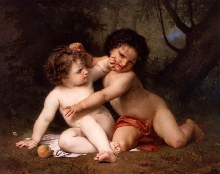
Talk about being in the right place at the right time! We just happen to be exactly at the spot allowing us to see this exceptional moment, from a location that shows us clearly and beautifully the story that unfolds, at a crucial moment of the plot. The figures are arranged to appear most beautifully composed from this particular angle, there is nothing in our way, the composition is carefully crafted to maximize our clarity and sense of beauty of the scene, and yet the way the painting is portrayed, it is like we are not even there. The characters in the painting do not know we are observing them or seem to recognize it, even though we are given the best seat in the stadium.
What’s even “funnier” is that paintings would often add random elements to make it seem like the painting is NOT intentionally trying to display itself to you, but that you rather accidentally stumbled across the scene. This is done by placing foreground objects (like the branches of plant covering the baby) and by keeping the main events off center.
But every now and then, artists also create visual art in the second or first person point of view.
The first person point of view in story telling, is when the author is describing their own experiences. Unlike the third-person pov, the existence of a creator is not taken for granted but is instead made the center of the work.
In visual art, this would be represented by self portraits where the artist is portrayed in the act of painting.
A perfect example is this self portrait by Elisabeth Vigée-Lebrun
The portrait presents to a viewer the creator herself, while creating a painting. It’s like writing a story that describes what the author is doing at any given moment. First-person storytelling in visual art is more tricky than in literature, because in literature, an author can describe themselves doing all sorts of activities, but in visual art, if the artist just shows themselves doing an activity, it wouldn’t be immediately known that it is them, unless the title or the plaque of the painting says so. And even then, it hardly changes the meaning of what is actually displayed in the piece. So mostly, first-person story telling are paintings about the act of painting. They may or may not acknowledge the existence of a viewer.
This brings us to the last category, the second-person point of view. In this method the existence of the viewer is acknowledged and the story is told as if told to you, the viewer. It is described in this website as: “This point of view treats the reader as the main character in the story. Other characters refer to the reader as “you.” Descriptions are based on what you would see if you were in that situation. This narrative voice is generally reserved for explanatory articles and how-to books, but adventurous writers will occasionally pen a short story or novel in the second person.”
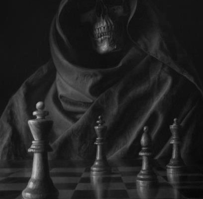
I could not think of a better example than this drawing by Jason Brady. It is more likely that many would think of this drawing as an interesting gimmick, but actually it is an example of a rare category of point of view in art. Art that interacts directly with the viewer and makes the viewer the center of the piece and the center of the story.
In this drawing, you are playing a chess game with death. I believe it is your move, and you better choose wisely because the price of losing is gonna be high.
You are deliberately given a low eye level. Death is towering over you. The chess pieces are giant, bigger than you, almost, and death is staring right at you, waiting for you to make your move.
A common type of second-person pov in visual art is portraits. Especially when the person in the portrait is looking straight at you.
Portraits are explicit about displaying someone to a viewer and they explicitly acknowledge the viewer, especially if the person in them is looking at the viewer like in this portrait. There is no narrative, though. It is a very simple, yet stylized, presentation of the character and looks of one person to another (or others, in plural).
Here is another example of a second-person pov, in this drawing by comic book artist Joe Madureira
You are definitely acknowledged as the part of the scene here. In fact, every painting in which a character deliberately makes eye contact with you, the viewer, is a second person pov.
Some paintings will make a viewer implicitly part of the scene without making eye contact or directly interacting with them. The painting can assign the viewer a role by controlling their location in the scene. The eye level and distance from the scene play a crucial role here. In third person pov there is an unexplained distance in which anything could happen. But some paintings will explain everything, all the way down to your nose. This can be achieved by rendering objects that nearly touch you or stand in your way as the viewer.
A scene could be either composed in a distance, as if you are watching a play, or it can be viewed from a point of view inside the scene. I can’t quite classify all examples, but consider this painting by Norman Rockwell, Freedom of Speech:
You, the viewer, is specifically located inside the scene, sitting in with the rest of the crowd, looking back to see this young man in the row behind you standing up. you even have the man next to him partially blocking your view. The painting does not acknowledge you directly as a viewer, but it assigns you a place in the scene that is inside the scene. He chose specifically to place us in the crowd’s eye level to emphasize the monumental action of the man standing up to speak. This effect would be nearly ruined if our eye level was changed to look at the scene from above, for example. And the meaning and focus of the scene would have changed completely if we were looking at the whole courtroom from a distance, even if the same event was depicted.
The majority of visual art works are in the third person point of view and set a scene that is viewed as if in a theater. The space between the viewer and the scene is not fully explained. You could be viewing it through a window, or a few feet away, or just seeing a poster. But You are not directly assigned a role or a place in the scene.
To illustrate, here are a few examples:
Frédéric Soulacroix, Spring
Frank Dicksee, Yseult
Ivan Shishkin, Gathering Storm
Thomas Couture, Romans during the Decadence
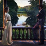
Richard Bergh Nordic, Summers evening
Maxfield Parrish, Morning
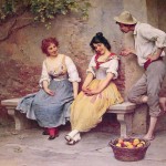
Eugen de Blaas, The Flirtation
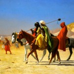
Jean Leon Gerome, Desert Quest
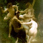
William Adolphe Bouguereau, Nymphes et satyre
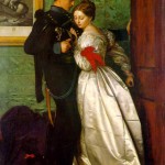
John Everett Millais
I hope you see that in all of these, you get a sense of a scene deliberately being displayed to you. You are separate from the scene, observing it. You are not part of it and no role is assigned to you. There is no voice of the creator, either.
Some paintings make the viewer part of the scene by changing the eye level, the distance from the picture plane, or add depth to the painting such that items in the painting extend beyond the displayed scene and reach out or encompass the location of the viewer. In all the paintings of the 3rd person pov above, there is a distance between the scene and the viewer which is not visually explained. In painting where the viewer is assigned a location or a role, that distance is explained. It is more common in game art which I included in some of the examples:
League of Legends Game art
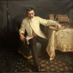
Arsène Vigeant, John Singer Sargent
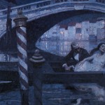
In the first, you are somewhere on the ground, the grass obstructing your view, just about to be discovered by this dangerous assassin. In the second, you are right in front of the man in the painting, who looks like he is about to step in your direction or start talking to you. In the third, there are those poles right in front of your face, while the area of the interest, the couple, is all the way in the right of the picture, suggesting you are viewing the entire scene by chance. The Degas painting suggests that you are right there in front of them, strolling around the room. there is really little distance between you and the people in the room. The gameart of Zyra, looking right at you, or the other Zyra which you catch a glimpse of from behind the plants. The size of the plants suggests that they are right in your face, which places you at a specific distance from the scene.
I find that many paintings are still difficult for me to categorize clearly. The tools of visual art are different than those of literature but I find a lot of fascinating commonalities between the two. Another thing this topic has made me realize is that the location of the viewer in your scene is a tool to communicate different messages in your artwork. Things like the eye level and perspective play a significant role, beyond just organizing objects in a scene realistically. They can serve the goal of involving a viewer in your painting to varying degrees. In many paintings, the viewer is just there to watch and appreciate and in some – to participate in different ways. Your art will have a different psychological effect and a different message depending on what you choose.
Having a grasp of general principles of balance allows an artist to draw figures better; to create a sense of stability, dynamic stability or a sense of someone about to fall over. Those are created by how the body’s position relates to the frame of balance. Poses can be classified in their relation to balance as: passive stable, active stable (holding an arabesque), dynamic unstable (mid-motion), passive and dynamic (you’ve fainted and your body is falling through Alice’s rabbit hole).
Considering different poses got me thinking about balance from a predominantly mechanical point of view rather than an artistic one and that’s the thinking that I’m detailing in this post.
The first principle to consider about active, stable poses is that our two feet (or whatever other body part touching the ground) create a stable structure, much like a table’s legs, on which the rest of the body can move and shift.
The metaphor of the table still holds true on one foot, because each of our feet is like a small tripod with three points of contact.
This is important because a table can balance weight in different distributions, like so:
And a human being balances different weight distributions on top of our legs in the same way:
The center of gravity of the stick figure on the right is further shifted to the right, but the two legs are able to carry the same weight just the same.
Legs can carry unequally distributed weight up to a certain point. Put the ball too far on the edge of the table and the table will fall sideways. Place your center of gravity too far extended in relation to your legs and you’ll fall.
But within a certain range, a variety of poses are possible with the same leg position.
It also works while standing on one foot because each foot is like a small tripod. A small tripod can balance a small area of weight distribution over it (or a small surface on which objects can be safely placed without toppling the table over to use that metaphor).
The bigger the surface area in contact with the ground the more stability is created and more room is created for “imbalance” on the table’s surface. A more elaborate base can be created by kneeling, standing on the hands, laying, sitting etc’. The more surface is in contact with the ground the more stable the base of the table is and the more room there is for shifting weight on the surface.
That means that there is no single “solution”, no single way in which the body must be positioned in order to be stable, given a certain placement of your two feet. You can balance a variety of positions with the same feet placement, similar to how you can place a heavy ball on the surface of a table in different distances from the center and it still remains steady.
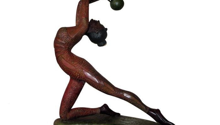
To illustrate; imagine this dancer, who is leaning back, slowly straightening out her torso and then leaning it forward with her arms reaching forward. She will still stay stable, with her legs in the same position as she does this, until the point when her base will no longer be able to support the strain of the imbalanced weight. (Little note: This sculpture is decor art sold by a manufacturer called bronze dancer figurine)
So far so good, but this completely neglects to mention that dynamic, stable poses are usually comfortably balanced. Stable poses on the verge of collapse are pretty unusual in art or in life drawing sessions, even though they are physically possible.
In a more classical figure drawing approach Ballance is carefully sought. The wise reasoning Andrew Loomis provides is:
“Balance is a physical attribute each of us must possess. If a figure is drawn without balance, it irritates us subconsciously. Our instinct is to set firmly on its base anything that is wobbling and likely to fall. Watch how quickly a mother’s hand grasps the teetering child. The observer recognizes quickly that a drawing is out of balance, and his inability to do anything about it sets up a negative response. Balance is an equalized distribution of weight in the figure as in anything else. If we lean over to one side, an arm or a leg is extended on the opposite side to compensate for the unequal distribution of weight over the foot or two feet that are the central point of division for the line of balance. If we stand on one foot, the weight must be distributed much as it is in a spinning top.”
Our body will naturally seek to minimize effort and that’s why balance is usually maximized in static poses. However, one foot is not exactly like a spinning top. It is a bit more like the 3 legs of a table; not by much, but by a little, perhaps barely enough to see difference, but a difference is there which is why we can create poses that are on the verge of being unstable but can still be held statically.
You may have heard it many times before that the way a contrapposto pose is balanced is by having different body parts lean in opposite directions to balance out the center of gravity and that the resulting center of gravity is placed above the weight bearing leg. So you may ask yourself; “if our feet can balance a variety of poses is it necessary for the different body parts to move opposite to one another or for the center of gravity to be placed above the weight bearing leg/ center of stability?” In my opinion the answer is no, they don’t 100% have to, but usually they will and it will happen naturally. For example, you think of extending your arms and torso forward and immediately your pelvis and legs will move in the opposite direction over your center of stability to balance the weight.
This is the case in these beautiful illustrations by George Bridgman:
This allows you to extend further sideways than if your legs and pelvis remained straight, and it reduces the load on your muscles. This compensation happens naturally. That leads the discussion to the last and important piece of the puzzle; the muscles.
Our muscles kick into action whenever we wish to hold a body part against gravity. lean forward and your back muscles have to work to keep you from falling forward. Lean backwards and your abdomen muscles have to work to keep you from falling backwards.
They operate in a more complex way than that, but in basic terms, your muscles kick in when you wish to hold a pose against gravity. They are there to serve as a glue that keeps your body parts from falling over. The more unstable the pose, the harder your muscles have to work to maintain it.
Dynamic stable poses can require a lot of muscle activity. Imagine a dancer’s arabesque, for example; Lots of muscle groups work to keep different body parts mid-air against gravity. So long as the muscle are able to keep working, the pose remains stable.
So to conclude, to think of figure drawing in terms of balance is to first get a grasp of the base of stability of a pose, and try to imagine what sort of range of imbalance it can hold over it (what size of “table surface” can such a base hold). Then, figure out how far out the “ball is placed on the surface of the table” in that pose. Is it an extreme pose on the verge of imbalance? Maybe it is a classically balanced dynamic pose (which it almost always will be).
Some poses are like moving a weight to the edge of the table, instead of comfortably placing it in the center of the table. It is fun to think of poses primarily in terms of their balance and thinking about it in those terms might help get the mood of a pose across.